
“Shitty marketing pisses me off.” This is the statement Oli Gardner opened his keynote with at SydStart 2015.
He said he clicks on everything he sees – every link, email, paid ad, banner, and social, because he wants to get a sense of how marketing is and how it’s being done. He wants to see if he can spot trends, and find a way to help people make it better.
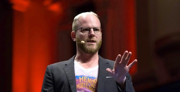
This is because Oli is the co-founder of leading landing page creator and conversion tool, Unbounce, and arguably the best person on the planet when it comes to landing page and conversion rate optimization. He has seen more landing pages than anyone on the planet.
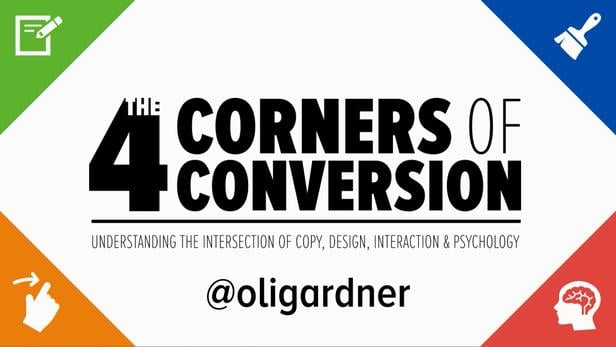
For his SydStart talk, he spoke about the Four Corners of Conversion – Copy, Design, Interaction, and Psychology – and why understanding how they play together creates high-converting marketing experiences. His focus, of course, was on his area of expertise – landing pages. “But your website is for organic traffic. Landing pages are for marketing campaigns,” he said.
According to Oli, customers shouldn’t be made to feel confused, angry or lost. They should enjoy being a part of the marketing experience. “Delight should be the default, not the exception,” he declared, and this is where the Four Corners of Conversion come in.
COPY
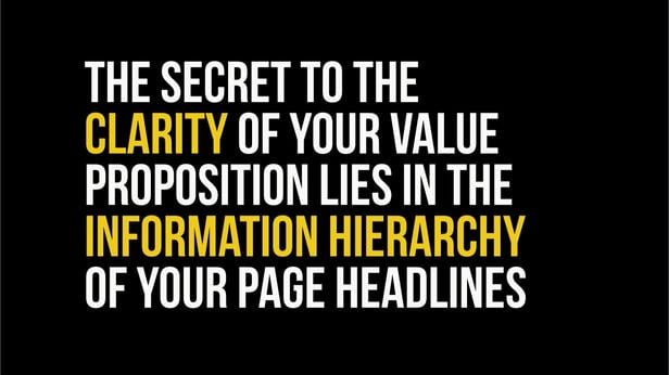
“The secret to the clarity of your value proposition lies in the information hierarchy of your page headlines.”
Clarity is everything in conversion and it lies in the order of how you tell your story. On the landing page, the subhead is supposed to add clarity to the headline, but it shouldn’t be the only thing that has clarity. Oli advised flipping the headline and the subhead to uncover extra clarity in the value proposition. He recommended listening to the voice of your customers and asking them to write your headline for you.
DESIGN
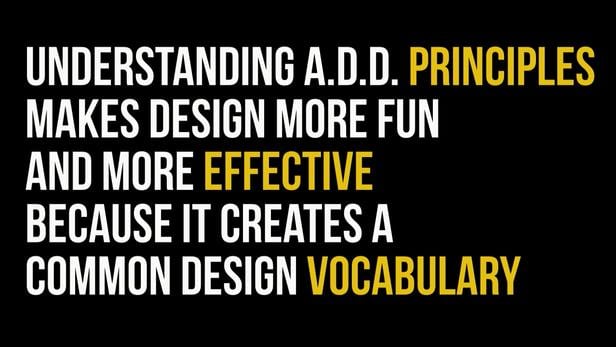
“Understanding A.D.D. principles makes design more fun and more effective because it creates a common design vocabulary.”
Nobody has been taught how to design for conversion. However, there are certain principles that you can apply to your landing pages to help you focus people’s attention on what you want them to do. For Oli, attention-driven design is important.
- Distraction – Thisis the enemy of landing pages. You have to get your attention ratio to 1:1. That is the ratio of the number of things you can do on a page to the number of things you should be doing. And, since a marketing campaign only has one goal, the landing should only be made to do one thing. As your landing page attention ratio goes down, your conversion rates go up. This is also, once again, why you should never start a marketing campaign without a dedicated landing page.
- Affordance – Things should look clickable if they are, buttons should look like buttons. There are things related to affordance that you should be careful about.
- Proximity – Elements in close proximity to one another are perceived to have a relationship. Protect your CTA. Anything placed in close proximity to your call to action can be a threat to your conversion rates – and must be tested.
INTERACTION
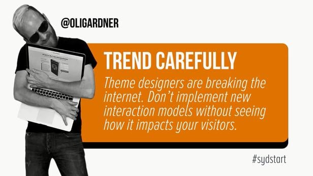
“Theme designers are breaking the Internet. Don’t implement new interaction models without seeing how it impacts your visitors.”
Oli discussed how everything has an interaction model. You don’t feel great interaction design and you don’t know it’s happening, but if you do it wrong, it’s bad. Carousels have been shown to kill conversions, as well as scrolljacking. If you need to do a theme, try and turn off those things, he said.
PSYCHOLOGY
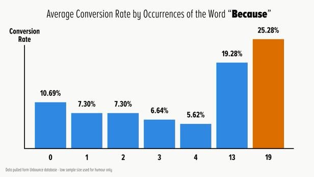
“What is the most persuasive word in the English language? Because.”
There are three levels of psychology at play, Oli said:
- Influence – Traits that can influence people
- Persuasion – Tactics you use to influence someone to do something
- Manipulation – Not a nice way to do it
To apply the Four Corners, here are a few things Oli mentioned to keep in mind:
- For Video – Caption your visuals.Put the video above the fold. 540×400px is ideal. For the CTA, the ideal place is 14 percent of the way through. As for who should be on your video, tribes that people can relate to are good, but experts are the best.
- For Forms – Field labels are influential. Mind your call to action copy.Certain words are more effective than others, like “Download Now” over just “Download” or “Get Started Now” over “Get Started.” The sweet spot for form location on the page is 666px. And when it comes to the number of form fields, test and see what’s the right number for you.
- Design for ideal. Lastly, don’t design to acquire any old customers. Design to acquire your ideal customers.
Get all these down, and you’re sure to have landing pages that convert.
Watch Oli’s full keynote with a Digital Pass.


